
 i am not what you would call a "nature" kind of person, though i do love big windows to look out at the world from. but i really liked these images and thought it would look great on my naked wall. but, as usual, i was rather shocked and appalled at the price of these, and then you still have to put it on yourself (it's vinyl). the other option is to pay out the nose for someone to paint it on the wall for you. but looking at it...it looks so simple, right? i mean, it's not real detailed, just a silhouette. i could definitely do that!
the plan:
i would rather have the effect on canvas rather than directly on my wall for a more tidy look. and i always kind of liked the whole "taking one image across multiple canvases" effect. don't ask me why, i don't have the proper artsy lingo to make it sound intelligent. i just do! so i would use three or four large canvases, paint, and vinyl. i have a friend with a silhouette sd, so the image, itself, shouldn't be too difficult. so, all in all, should be pretty easy!
plan change #1:
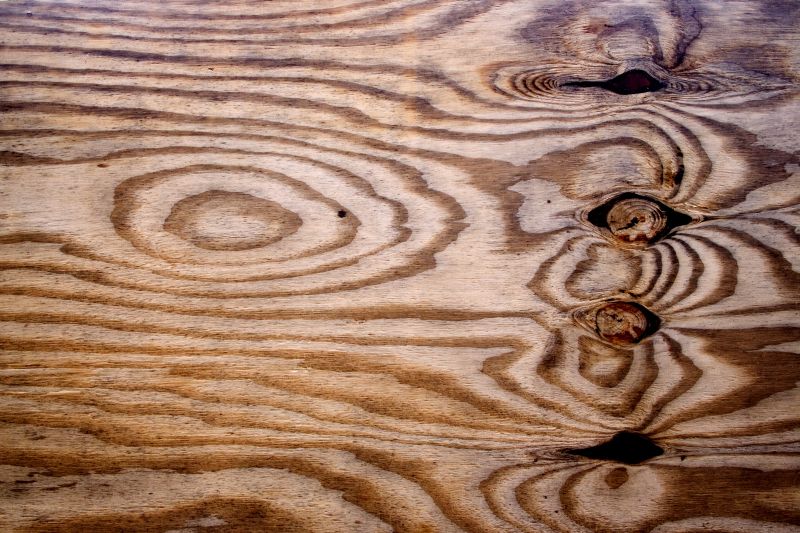
canvases that large are really expensive. so i decided on plywood panels instead. easily found at home depot.
plan change #2:
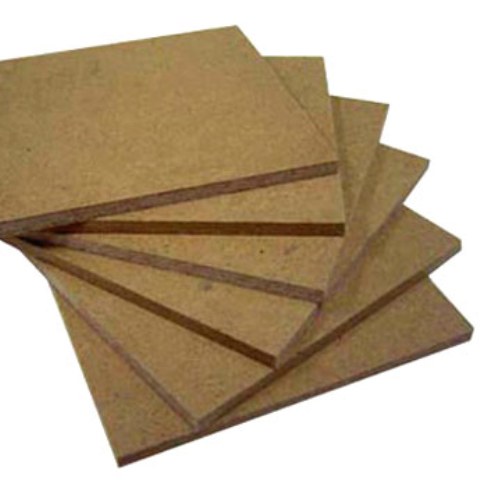
the plywood was too rough of a surface and had a lot of flaws (knot holes, chips, ect.). so i decided on mdf. also easily found.
plan change #3: (i apologize for the lack of pictures beyond this point. i did this before i decided to start the blog, so it didn't occur to me to take pictures during the process.)
as i discussed this project with friends who know more than me about crafts (that could be anyone, but this particular group included people who use vinyl on a regular basis), it was mentioned that i should use freezer paper instead and make a stencil, then paint the image instead. sounded a little out of my league...but then, most craft issues do. i decided to try it, though, because, really...how hard could it be?
**note: freezer paper, as i learned in the middle of this process (the shopping part), is not something you find in craft stores as you might expect. do not go to hobby lobby in search of it, and do not ask the employees there for assistance finding it. not that anyone would do that....just sayin'.
so, with my three panels cut (2.5 x 4), i simply painted them a solid background color (i chose a light blue). i bought an image off of the silhouette website and a couple bird images off the internet and had my friend use her silhouette sd to cut them out.
plan change #4:
the silhouette board was not big enough to use the freezer paper. so we ended up using vinyl without the board for the branches and the freezer paper only for the leaves, flowers, and birds. normally, you would keep the cut outs from the silhouette, but we tossed that part and used the "scrap" as a stencil to paint on.
**note: the silhouette sd is not recommended for images longer than 3 to 4 ft. mine was a little over 7ft, and there were quite a few flaws that needed to be fixed with free handing later.
we put the panels together on the floor and laid the vinyl stencil on, filling in the cut out space with the brown paint. then we ironed the leaves and flower stencils of freezer paper (wax side down) in various places. the freezer paper was good in that it was reusable, but we ran into a problem with the iron leaving marks on the background paint. it took a lot of touch up to cover it back up. perhaps it would work better with a cover of some sort over the iron? we painted in all the stencils and then tried to free hand the rest that we could get a stencil for. luckily, my friend is a much better artist than i.
because the vinyl does not stick as well as the freezer paper, the edges of my tree were rough. i went back with the blue and a smaller paint brush and made the lines cleaner.
i am pretty pleased with the final result:


all together, including the craft paint (i already had the blue paint from when i painted my bedroom), this project cost about $35. totally worth the time and effort to save the hundreds a real art piece this size would run! i would definitely recommend trying it should your walls be suffering nudity.